Between thumbnail and finished letter form is a well trod path. Typographer and designer Alan Ariail is kind enough to document the entire process from ideation through culling and dead ends on his blog, The Art of Hand Lettering. An excerpt is shown below.
Stockman & Dakota logo script
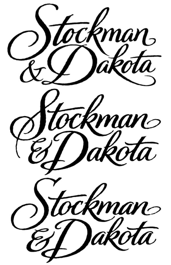
While watching the morning news today I saw a commercial for Stockman & Dakota with the logo script I created. This project goes back to 2008. The creative director at Brandimage sent me a sketch with the printed logo. The script was difficult to read with too much visual distraction of the loops and off balance structure with compressed letterforms. This logo was going to be reproduced at small size for web and print. My goal was to make the script readable.
The first step was to do some rough brush scripts for study of lettering flow. I created several sheets of quick roughs with these versions used as drawing templates.
Using the template as reference I started drawing the letters with a thin line and adjusted the thicks and thins. I decided not to
pursue the loop of the t and the continuous loop of the double k.
Another screenshot showing a thin line starting point altered for proper thick to thin weight.
The 3 final versions sent to the creative director who requested the lettering to have a rough deckled edge treatment.
The finished logo script as used on the Stockman & Dakota website.


A typographic, designological, visulicious extravaganza!