This odd exerpt was part of a longer piece that came out of Seattle’s The Stranger, a weekly. As for eye color being linked to color perception… cough, cough, bullsh*t. Uh hem.
Color TheoryA century ago, more than half of all Americans had blue eyes. By 1950, that number was down to one in three. In 2006, only 16 percent of all Americans had blue eyes. Why, then, do almost 90 percent of PSUBS members have blue eyes? These aren’t made-up numbers. This is the real science.
And what if the color of your own eyes influences the colors you perceive? What if blue-eyed people perceive color differently than those around them? If there were certain colors, certain colors that were perhaps complementary to blue, certain colors that resonated with the rods and cones of blue-eyed people in a way that brown and green rods and cones can’t detect… If there were such a color…
It would almost surely be Pantone 14-0848.
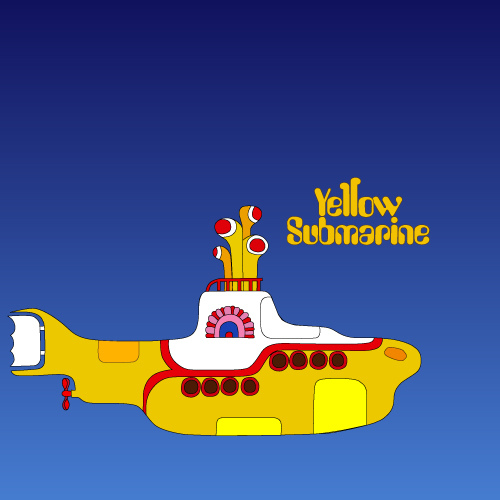
Leatrice Eiseman, director of the Pantone Color Institute, calls it Mimosa. I call it Submarine Yellow. It was the 2009 Pantone Color of the Year™. “The color exemplifies the warmth and nurturing quality of the sun,” Eiseman said matter-of-factly, like she was explaining a math equation. “It speaks to enlightenment, as it is a hue that sparks imagination and innovation.”
Full disclosure: Eiseman and I have had dinner together. At her place on Bainbridge Island. It was not a date.
The draw to submarines has something to do with Pantone 14-0848. It must. That scuba yellow. That 1962 deep Jacques Cousteau yellow that says, confidently and with a slight French accent, “Submareeene… rebreazer… skeendiving…”
