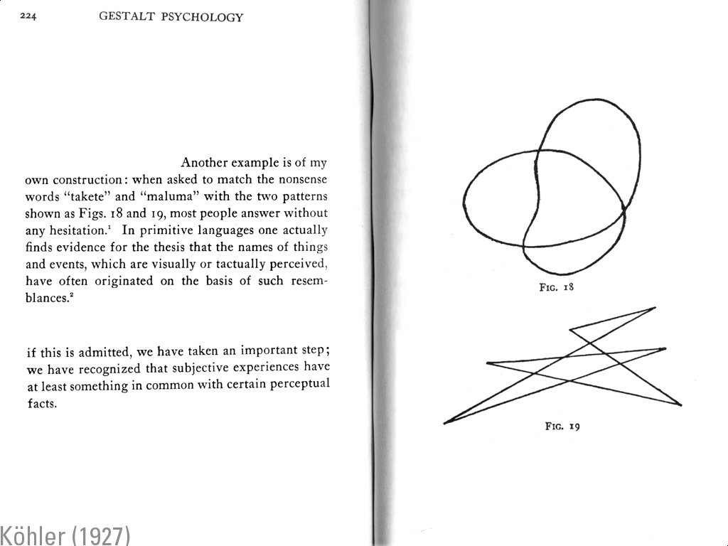
The idea that sounds have shape should permeate our visual language of typography. But it doesn’t. Why? There is more emphasis on the aesthetic continuity of letter forms than the sound representation. Is this a function of the mutability of pronunciation regional dialects? Technology is opening new possibilities. As long as we are reimaging the meaning and function of the book we should reimage the word forms themselves to provide us with greater specificity and poetics. Sound and meaning specific kerning pairs open entirely new literacies and communicative possibilities. Who’s with me?
You can find out more about phonaesthesia here, here, here and here.
