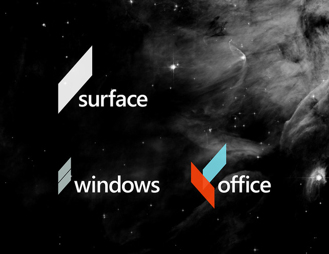
Just a reminder to everyone: students are capable of professional level work and professionals are subject to committees. When building your portfolio, show your best work, which is not necessarily the work your teacher/client/mom liked. (Read the whole thing: here!)
“I think the flaw with Microsoft’s rebrands is that they aren’t cohesive,” comments Andrew Kim, a 21-year-old designer who recently reimagined the company’s brand identity during a three-day design charrette. “It feels outdated and has connotations that aren’t helping Windows Phone or Surface.”

